
Table of Contents
Differential signaling
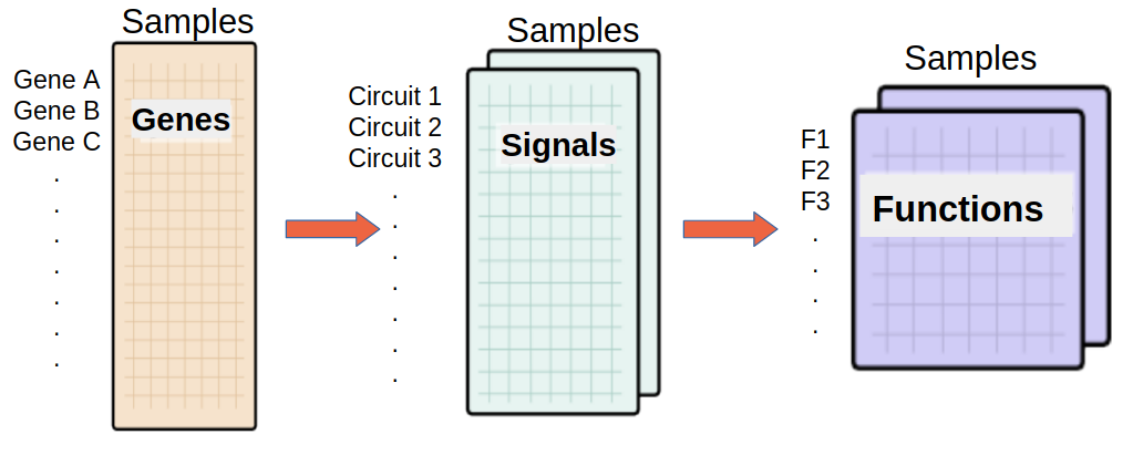
HiPathia allows inferring a value of signal transduction activity through any of the different circuits defined in any signaling pathway for each sample in the analyzed dataset, based on the gene expression values. Therefore, the same way that in a transcriptomic experiment differential expression between two conditions is conducted, HiPathia allows comparing the signal transduction activities between different conditions in a differential signaling asessment. We can:
- Compare two conditions, for example normal vs tumor samples.
- Correlate the signal transduction activity with a continuous variable.
The tool can be accessed from the main menu bar, by clicking on the Differential signaling button, see Workflow for further information.
Differential signaling form
The main page of the tool is its filling form. This form includes all the information and parameters that the tool needs to process a Differential signaling study. The form is divided into different panels:
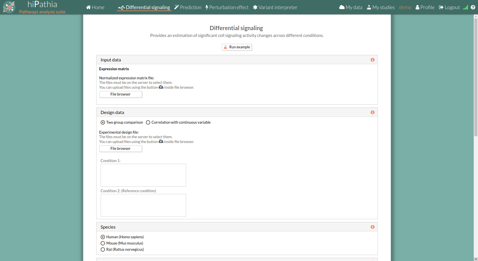
Input data panel
In the input data panel, we must introduce the expression data.
 The expression data is a gene expression matrix provided by ourselves (see how to upload files in Upload your data).
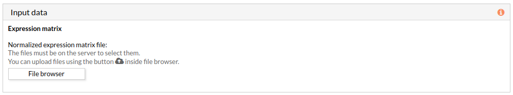
When we select a gene expression file, the number of samples of this matrix will appear under the “file browser” button as shown below.
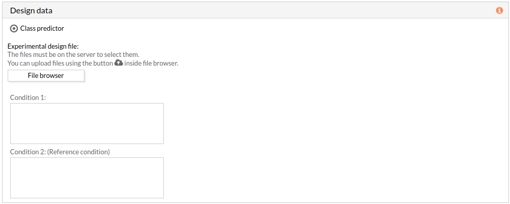
Design data panel
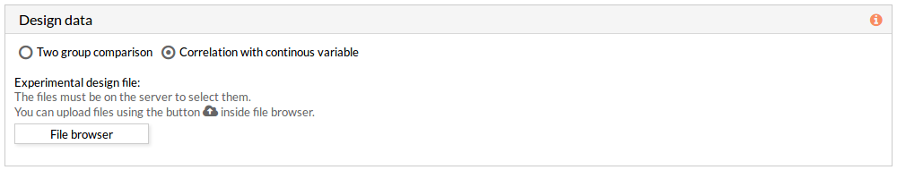
The design data panel allows you to choose the kind of experiment you want to perform. You can choose between two kinds of experimental design:
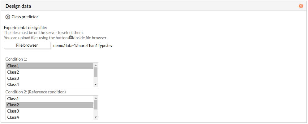
- Two group comparison: The comparison is performed between the two groups described in the experimental design file.
The experimental design file must include two columns: the first one with the names of the samples, the second one with the class to which each sample belongs.
 If the experimental design file contains more than two classes then you have to select the appropriate class for each condition.
Note: the condition 2 will be taken as a reference condition.
- Correlation with continuous variable: A correlation is performed between the values of each effector circuit along the samples and the continuous variable introduced.
The experimental design file must include two columns: the first one with the names of the samples, the second one with the value of the variable for each one of the samples.
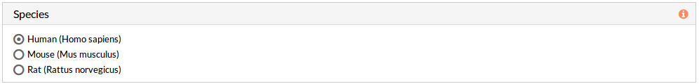
Species
Here we must choose the species of our experiment. You can choose among:
- Human (Homo sapiens)
- Mouse (Mus musculus)
- Rat (Rattus norvegicus).
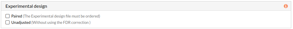
Experimental design
This panel includes further parameters necessary to run a study.
- Paired: Check to consider paired data in the analysis. When not selected the analysis is performed using unpaired parameter for the used statistical test-Wilcoxon-.
Note: The Experimental design file must be ordered. - Unadjusted: Check to don't use the FDR correction, this will select significant circuits depending on the p-value of the Wilcoxon test. (when not selected adjusted p-value will be used). More about FDR...
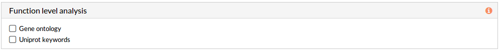
Effector annotation source -Function level analysis-(Optional)
If any of these checkboxes is selected, a differential functional activity analysis is performed.
From a given gene expression profile, we estimate an effector proteins activation profiles and then we annotate each effector proteins using Gene ontology and Uniprot keywords annotation.
- Gene ontology: a functional analysis with annotations of Gene Ontology is performed.
- Uniprot keywords: a functional analysis with annotations of Uniprot keywords is performed.
Pathways
This panel includes the list of all available pathways in HiPathia. We can select the pathways with which the analysis will be performed.
HiPathia retrieves pathway information from KEGG database. KEGG pathway database is a collection of manually drawn pathway maps representing the knowledge on the molecular interaction, reaction and relation networks.
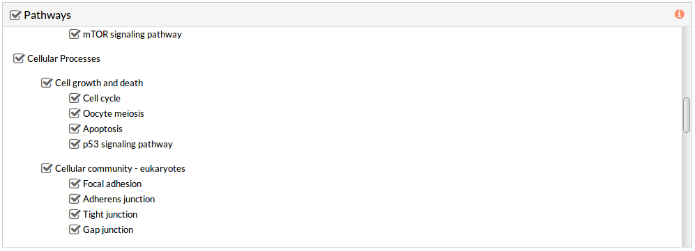 By default all available pathways are selected.
Note: At least one pathway has to be selected.
Study information
This panel includes some parameters in order to identify and save our study.
- Output folder: If we want to reorganize our studies we can select the folder in which we want save our report. By default the study will be saved in the home in a folder named “Differential_signaling_study-N”, N is an integer number.
- Study name: We can give a name to our study. This is very useful to later identify it among the other studies listed in the My studies list.
The default study name is “Differential_signaling_study-N”, N is an integer number. - Description: We can give a description to our study.

Run analysis
Once the form has been filled in, press the Run analysis button to launch the study.
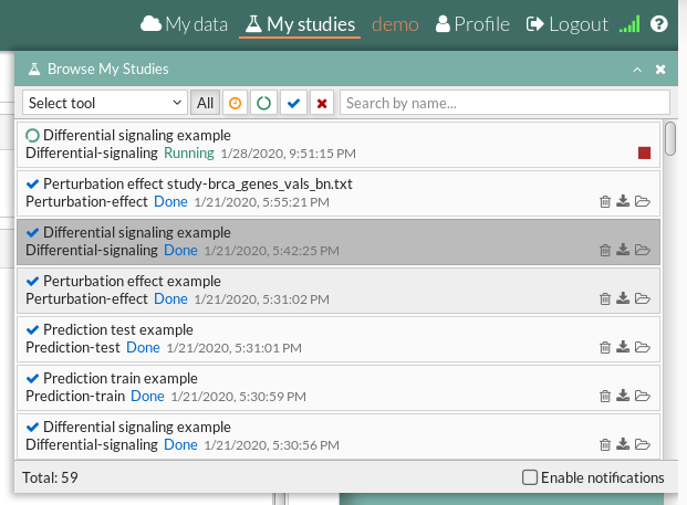
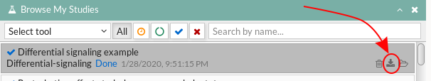
 Your study will be listed in the My studies panel, and a panel called Browse my studies will appear showing all your studies and their state. the new study will appear with a queued state then running state. If everything goes well, the state will be done after few minutes(depending on the inputs data and the availability of server).
All study states are:
Your study will be listed in the My studies panel, and a panel called Browse my studies will appear showing all your studies and their state. the new study will appear with a queued state then running state. If everything goes well, the state will be done after few minutes(depending on the inputs data and the availability of server).
All study states are:
- Queued: The information has been processed and the study has been sent and waits to be processed.
- Running: The study is in progress, study can be cancelled using the stop button.

- Done: The study has ended and the results are available to visualize and download.
- Cancelled: The study was canceled before finishing.
- Error: Sometimes a study can stop returning a error message, you can report and contact us in order to help you to fix it.
see Workflow for further information.
Differential signaling report
When an analysis is finished at Hipathia web, the report of such analysis will be available in “My studies” section once the study is done.
The results page of the Differential signaling tool includes different output results. You can download any table or image showed in the report page by clicking on the name right before it.
You can also download the circuit activity values and function matrices by clicking on Circuit values, GO terms values and Uniprot keywords values respectively.
Furthermore, the report can be downloaded in order to visualize it locally.
 The downloaded RAR file has to be extracted then you can open the “index.html” file using a web browser like Firefox web browser, some configuration may be needed for chrome or other web browsers: installation of web server( for example: Wamp or XAMPP) then open the report from the navigator using http://localhost/Path/to/my/downloaded_report/)
The results are divided in different panels:
Study Information
Here you can find the information about the selected study.
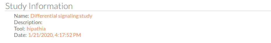
- Name: the study name.
- Description: the description of the current study.
- Tool: the name of the used tool (in this case, is Hipathia).
- Date: study's launching date (MM/DD/AAAA, HH:MM:SS AM/PM format)
Input parameters
Here you can visualize the parameters with which the current study was launched.
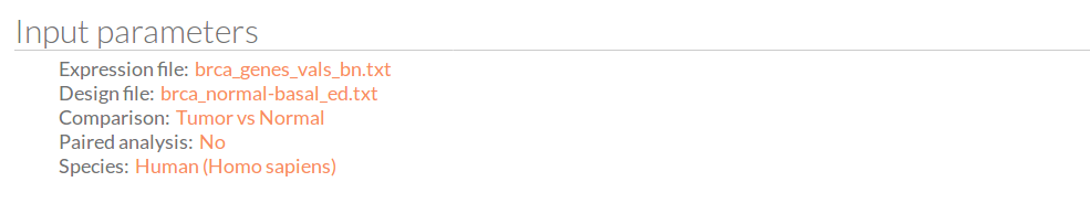
- Expression file: The name of the expression file that has been used in the current study.
- Design file: The name of the design file that has been used in the current study.
- Comparison: The groups that have been compared, for example; Normal vs Tumor.
- Paired analysis: Have the input data been paired? No or Yes.
- Species: The species of this experiment; Human (Homo sapiens),Mouse (Mus musculus) or Rat (Rattus norvegicus).
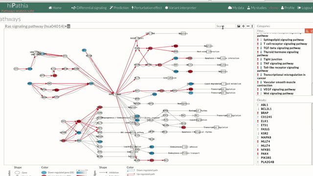
Pathways
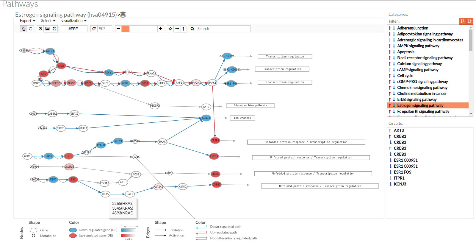 A pathway viewer has been developed in order to make easier the visualization of the comparison results. it shows a graphical representation of the comparison on the activation levels of the “Effector circuit” between the two groups. The meaning of the different symbols that can be found are in the legend below.
 The information summarized in the pathway viewer includes:
Node's shape:
- Ellipses correspond to genes.
- Circles represent metabolites.
- Rectangles are cellular functions.
Node's color:
- Blue for down-regulated genes, red for up-regulated genes and grey for not significant genes.
- The intensity of the color depends on the significance of the differential expression.
Edge's shape: Edges represent either activations or inhibitions.
- Activations are represented by classic arrows.
- Inhibitions are represented by T arrows.
Edge's color:
- Circuits which are up-regulated in the disease condition (condition 1) have their arrows colored in red.
- Circuits which are down-regulated in the disease condition (condition 1) have their arrows colored in blue.
- Circuits which are not significant for the test have their arrows colored in grey.
- When an edge belongs to different circuits which should be colored in different colors, different arrows are depicted, each one for each necessary color.
The pathway viewer has four principal parts in order to facilitate the visualization of the results:
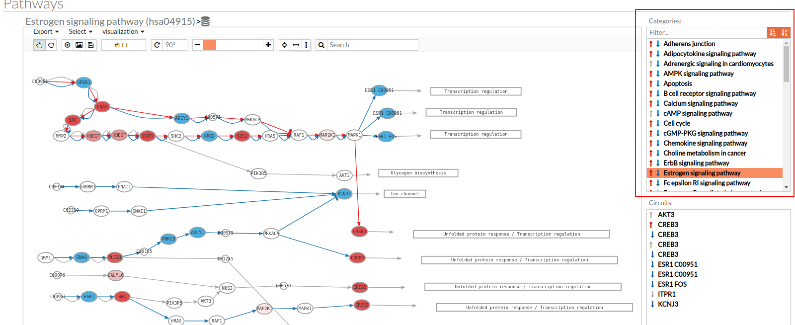
- In the upper-right part of the visualization tool, all selected pathways from the differential signaling form are shown along with one or two arrows. These arrows indicate whether in one of the “Effector circuit” within each pathway a differential activation pattern between the two compared groups have been found.
The arrows will be colored if the differential activation is significant after the p-value adjustment (or unadjusted p-value, if the “Unadjusted” parameter has been selected) and depicted in grey if it isn't.
The arrow will point up or down if an up-regulation or down-regulation of the signal occurs between the circuits within that pathway.
The meaning of this up or down-regulation depends on the comparison performed, that normally would be case vs. control (comparison between selected class from the design file : condition 1 Vs condition 2).
Only one arrow is shown if all the effector circuits are whether up or down-regulated.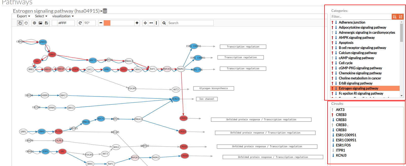
- In the lower-right part of the tool will appear all the circuits in which a pathway (previously selected on the upper part -1-) can be decomposed. Once any of the circuit is clicked the nodes and interactions (edges) that form part of this circuit are highlighted in the pathway viewer, One example might be the red-highlighted circuit on the figure below.
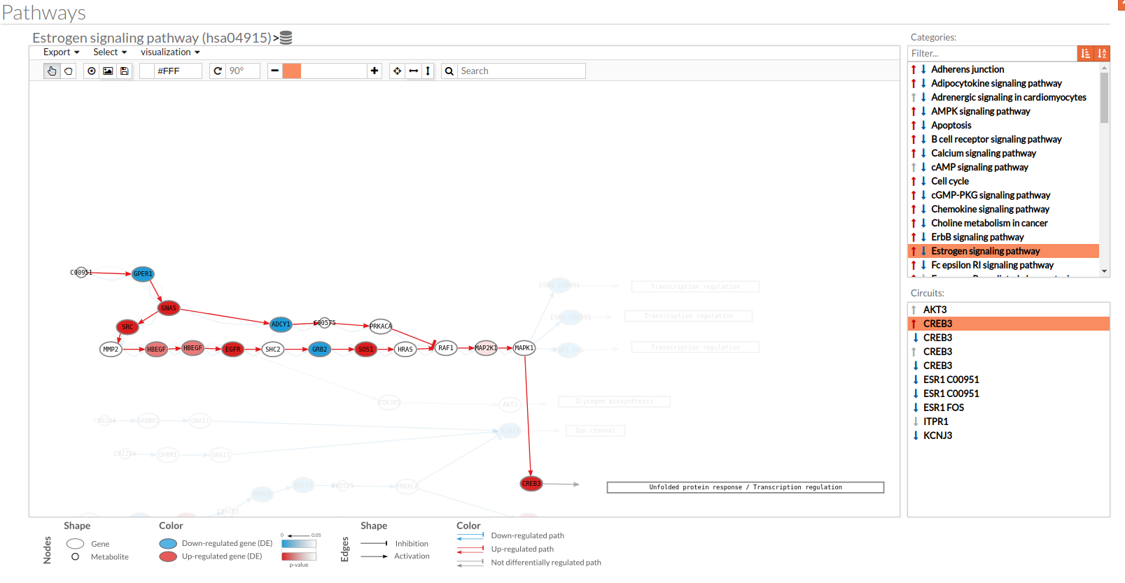
- In the visualization part there are two types of objects, the nodes and the edges.
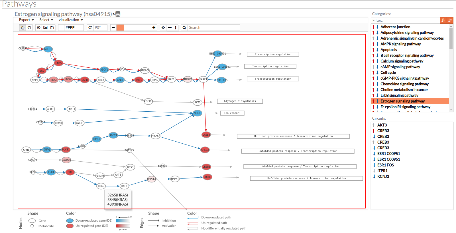
- The nodes represent the different proteins or metabolites that are responsible of the transduction of the signal from the previous node to the next one. As commented before, the nodes can be plain or complexes. In the former it is only necessary the presence of one protein (although that same function can be done by several proteins), while in the complex ones it is necessary the presence of two or more proteins to pass the signal through.
The color on the nodes are the result of a differential expression analysis on the gene/s involved on performing that node's function. - The edges represent how the interactions between the different nodes are.
If the edge is an arrow then the previous node will be activating the next one, while if it ends with a vertical bar is the former node will inhibit the functionality of the following node. This interactions may be depicted in red or blue depending on the circuit they form part of (whether they are up-regulated or down-regulated). It may occur, that two or even three colors for a same edge are shown, but this only happens when a circuit is not yet selected on the lower-right part of the tool.
Once an certain circuit is selected all its edges will be colored in the same color depending on the result of the differential signaling activation analysis.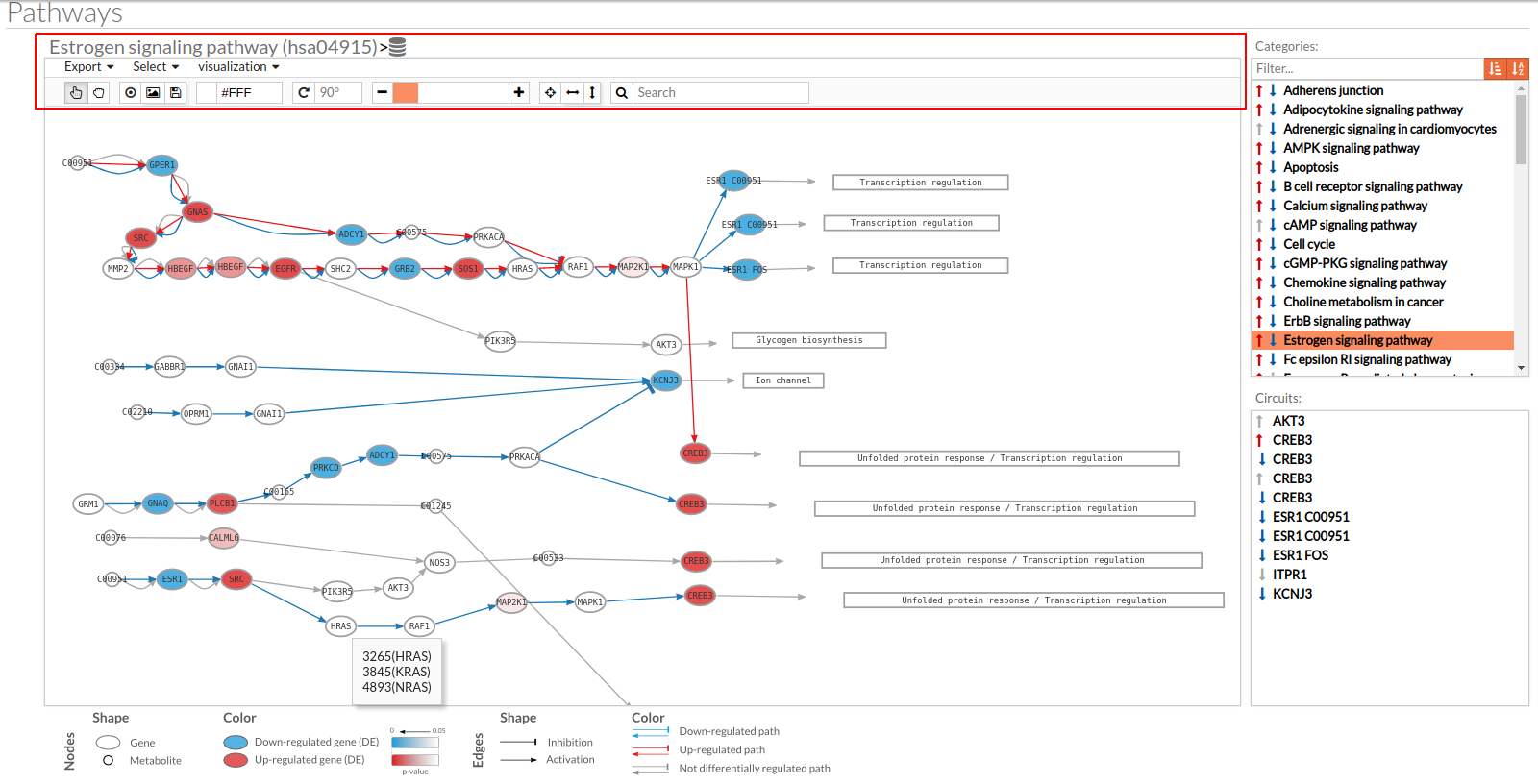
- The top part contains the title of selected pathway,by clicking on this button
 you can see the original source of this pathway.

You can also find other buttons like:
 Allow to search specific genes, proteins or functions.
 Export a SVG image of viewed objects (the whole pathway or just the selected effector circuit)
 Save a new layout of the current study/session. If the new layout is successfully saved a message will appear at the bottom, as shown in the image below:
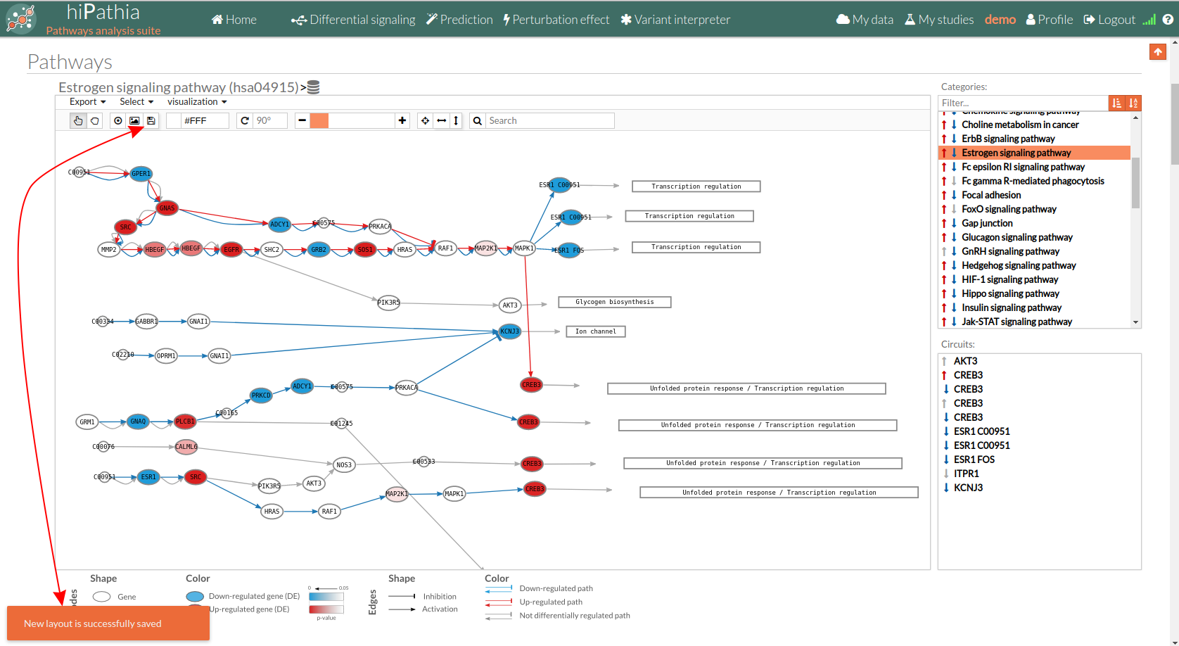
 Center the selected pathway
 Width adjust
  Height adjust
  Change mode between Select any element (node /edge) and allows to move the whole network along the canvas.
Circuit values
Here you can find additional tables and plots:
- The first section below there is a link to download the calculated circuit activity values. This matrix file indicates for each effector circuit the level of activation calculated using Hipathia method for each sample.

- The Heatmap plot represented on the hipathia results page is a heatmap of the activation values from the most differentiated effector circuits (rows) between groups along with a clustering of the samples (columns). This plot allows to observe if its possible to differentiate the groups that are compared according to its effector circuit activation values.
The colors depicted here indicates the level of activation for the different circuit in each sample, being the bluish ones those with lower activation levels and the reddish the highest ones (e.g. if a given cell of the heatmap is blue would indicate that this particular effector circuit is poorly activated in that determined sample)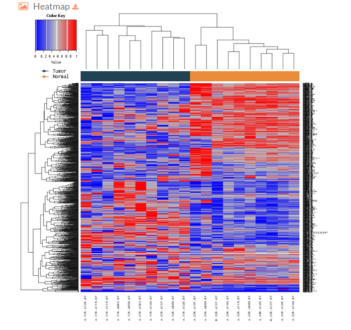
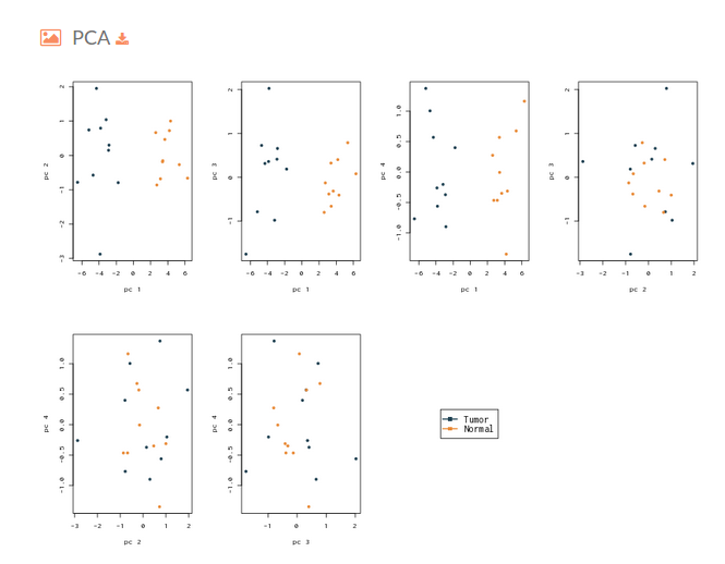
- The next plot on the Hipathia report corresponds to a Principal Component Analysis plot. This figure is useful to determine if the activation levels of the signaling circuits calculated with Hipathia are able to differentiate between the two groups that are being compared.
- In the section below there is a table (that can be downloaded) with the results of the differential activation analysis. This table indicates for each effector circuit whether or not there is a different level of activation depending on the group the samples belong.
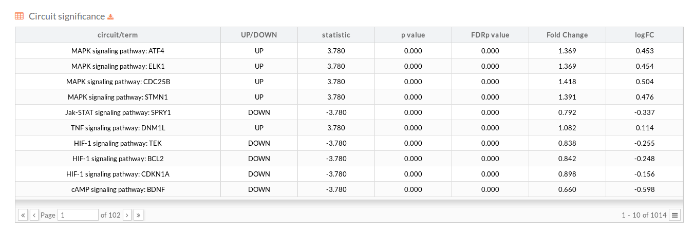
- circuit/term: Code identifying the circuit consisting in the name of the pathway to which it belongs and the effector (last) node of the Circuit (pathway Name : Effector).
- UP/DOWN: Up when the circuit is up-regulated in the disease case, DOWN otherwise.
- statistic: Statistic of the Wilcoxon test performed between conditions.
- p.value: P-value of the statistic test.
- FDRp.value: Adjusted p-value of the statistic test using the FDR method.
- Fold Change: is a measure describing how much the circuit activity changes between conditions.reed more about Fold Change
- logFC: The logarithm to base 2 of calculated Fold change.
Function based analysis
For each of the functional analysis selected to be performed, the same descriptive statistics as in the Path values case are shown:
- GO terms/Uniprot keywords values: You can download the matrix of function values by clicking on GO terms values or Uniprot keywords values.
- Heatmap: A heatmap is a graphical representation of the values of a matrix. A not-supervised clustering is performed on the data per columns (samples). A good separation between the two colors of the upper bar of the heatmap indicates that the differences between the two groups are big enough to discriminate between them.
- PCA: A Principal Components Analysis is performed in order to see if the matrix contains information enough to separate between the two groups.
- GO terms/Uniprot keywords significance: Ordered table of the functions significance. More significant terms are displayed in the upper part of the table. For each functional term, the following information is shown:
- path/term: Name of the function.
- UP/DOWN: Up when the function is up-regulated in the disease case, DOWN otherwise.
- statistic: Statistic of the of the statistic test.
- p.value: P-value of the statistic test.
- FDRp.value: Adjusted p-value of the statistic test using the FDR method.
- Fold Change: is a measure describing how much the circuit activity changes between conditions.reed more about Fold Change
- logFC: The logarithm to base 2 of calculated Fold change.